My So-called Secret Identity 's Mind Maps: On The Road to Webcomics
Assistant Professor, Department of Visual and Media Arts, Emerson College, 120 Boylston Street, Boston, Massachusetts 20116, USA
*Address all correspondence to: S. Zaidan, Department of Visual and Media Arts, Emerson College, 120 Boylston Street, Boston, MA 20116; Tel: (+1) 617-827-8500, E-mail: sarah_zaidan@emerson.edu
My So-Called Secret Identity is a superhero comic series in which the protagonist is a PhD student whose superpower is her intelligence. Created collaboratively by cultural studies and cinema professor Will Brooker, illustrator Susan Shore, and artist, game designer, and historian Sarah Zaidan, the series launched as a webcomic in 2012. Over the next four years the series would grow to influence other artists and creators, becoming a text in and of itself. The series' use of mind mapping to illustrate its protagonist's thoughts was a unique aspect of the comic, and the processes and reasoning involved in their creation contain and reflect artistic and academic influences central to the comic itself. In this article, Zaidan discusses how she transforms the mind map from a learning tool into a tool of storytelling and the integral role digital comic distribution and crowdfunding played in the reception and impact of the series.
KEY WORDS: webcomics, comic books, superheroes, cultural studies, interdisciplinary studies, media studies, collaboration, semiotics, illustration, digital art
1. INTRODUCTION AND HISTORICAL CONTEXT
The history of the contemporary comic medium is closely connected to that of communication media and to the history of media arts as a whole, particularly in Western culture. Although storytelling through a combination of text and image is ostensibly a form of communication stretching back millennia, newspaper comic strips and editorial cartoons flourished in America and England toward the end of the 19th century. The Industrial Revolution brought with it innovations in the production of newspapers and magazines, translating to more affordable, and thus more accessible, printed materials with easily reproduceable artwork. In this era, the subject matter of these comics predominantly focused on slice-of-life stories and the politics of the day, often with a humorous tone, and their mass market appeal led to increases in the sales and circulation of newspapers. By the early 1920s, newspaper comic strips were being collected and reprinted in a dedicated book format, heralding the start of what would become a flourishing industry in the decade to come.
The Great Depression of 1929 did not slow down the spread of comic books, with original content becoming a common sight alongside newspaper comic strip reprints, particularly after Major Malcolm Wheeler-Nicholson founded New Fun: The Big Comic Magazine in 1935. Wheeler-Nicholson had been a writer of pulp novels, inexpensive paperbacks and magazines that were hugely popular between World War I and World War II and got their name from the low-quality paper they were printed on. Pulps were cheap, entertaining, and often featured beautifully illustrated covers. There was something for everyone, be it horror, crime, romance, science fiction, or fantasy, and this inspired Wheeler-Nicholson to look beyond the bound reprints of newspaper comic strips and conceive of comic books filled with entirely new material, bringing the florid prose and intense action offered by the pulps into a new medium. Pulp heroes like Robert E. Howard's Conan the Barbarian eventually made the jump to comic books, and even film characters such as Philip Nowlan's Buck Rogers or Walter B. Gibson's The Shadow are still well known today. Although Wheeler-Nicholson's poor business sense led to the demise of his company in 1938, under the new management of pulp publisher Harry Donenfeld and Jack Liebowitz, the renamed Adventure Comics would go on to become industry giant DC Comics in the coming years.
To meet the demand for original content, comic book publishers established the “shop system,” where artists created work for up to a dozen publishers at a time. Although comic books were among the most common forms of American mass media at this time, with their affordable price, portable formats, and appeal across all demographics, the shop system was an arrangement that exploited artists (who were more often than not uncredited for their work), and it continued through the 1940s, in response to the explosive popularity of the superhero genre following Superman's debut in 1938 (Sabin, 1993).
Created by teenagers Jerry Siegel and Joe Shuster, who were inspired by pulp novels, the burgeoning science-fiction genre, and heroes with Biblical and mythological origins, Superman was an instant success. As the 1940s began, the market was flooded with competitors and sales of superhero comics eclipsed that of other genres. Publishers took advantage of this when World War II began, churning out vast quantities of superhero stories that featured patriotic plots and motivational messages, such as Joe Simon and Jack Kirby's creation of Captain America in 1941. These comics were sent to soldiers on the front as well as purchased by readers at home. Superheroes battled Nazis, helped American troops, sold war bonds, and inspired a nation with the period frequently referred to as the Golden Age of superhero comics. Although Superman's massive popularity led to both a tie-in radio show and an animated series, † comic books remained the most readily available and cost-effective form of mass media for fans of the character (Duncan and Smith, 2009).
In the technological boom of the post-war 1950s, television became the dominant form of mass media in most American households, leading to a drop in comic book sales and, with it, the end of the shop system. Genres such as crime, Western, horror, and romance comics rose in popularity as superhero titles sold poorly. However, the biggest changes to the industry occurred following the comic book Senate hearings in 1954. The idea that comics were detrimental to their young audience was not a new one. Studies on comic books' effects on American children and young adults can be traced back as far as 1906 and continued throughout the 20th century. ‡ However, it was not until the Senate hearings that any of the criticisms against comic books led to major changes in this form of mass media. Dr. Fredric Wertham's research focused on the role of culture in social psychology, an area he believed was underdeveloped in his field (Nyberg, 1998). His aim was “to understand the ways in which mass media shaped society” (Nyberg, 1998), a common focus of scholars in 1950s America. He also researched the psychology of violent crime, and through his work with children and young adults at the Lafargue Clinic, a nonsegregated psychiatric clinic in Harlem, New York, Wertham began to perceive a correlation between delinquent behavior and reading comic books. This led him to believe that the sale of crime-themed comic books to children under the age of fifteen should be banned.
Wertham's 1954 book Seduction of the Innocent was a product of these beliefs, not “an objective overview of the comic book industry, but a deliberately sensationalized portrait of the worst that comic books had to offer” (Nyberg, 1998). His arguments appeared so sound that the Senate formed a subcommittee to examine the ties between comic books and juvenile delinquency, comic book burnings took place across the country, and the entire industry was in a panic.
That same year, the publishers of DC Comics, Timely Comics (later Marvel Comics), and Archie Comics formed the Comics Code Authority in response to the negative publicity the comics industry experienced during the hearings which, “combined with pressure from distributors, wholesalers, and retailers, brought sweeping changes...crime and horror comics disappeared from newsstands” (Nyberg, 1998). Only code-approved books were allowed to be distributed or sold at newsstands, grocery stores, or drug stores. These were the only places one could purchase comics at the time. Despite these efforts, EC Comics, the first name in horror and mystery stories, closed down, and the worst recession in the industry's history followed soon afterward.
By the second half of the 1950s, the stigma surrounding comics that had been caused by Seduction of the Innocent had begun to die down, but comic books had largely lost their adult readership and became established in the popular consciousness as children's entertainment. The 1950s is a decade that throws the relationship between comic books, the dominant form of mass media, and the accessibility of technological innovations to the majority of a population into sharp relief, a relationship that only becomes more evident as the twentieth century continues.
The 1960s saw the first comic book stores opening across American cities and a more established presence for conventions where fans and creators could congregate. Now there were dedicated places to purchase comics, cementing their status as a niche hobby with a small, albeit passionate, fan base largely made up of college-age Baby Boomers. The comic book industry reflected the social ideologies of the time, resulting in the demand for a superhero with more depth of character than the straightforward patriotic heroes of the 1940s. In addition, the fascination with space travel and humorous storylines characterized by comics of the 1950s were not enough to maintain readership. Where it would have been unheard of for a 1940s superhero to express doubts about his calling, question the purpose of war, or agonize over how apprehending a bank robber has caused him to miss a date with his girlfriend, themes such as these became prevalent in comics of the 1960s. Marvel Comics' titles Spider-Man (1962) and The Fantastic Four (1961), which were penned by Stan Lee, excelled at this. Lee, along with artist Jack Kirby, often reached out to fans of their work by visiting college campuses across America and responding to letters and comments sent in to Marvel by fans (Sabin, 1993).
The 1960s and 1970s also saw the rise of underground comics, or “comix.” Created and frequently produced by amateur and emerging artists with no connection to the mainstream comic industry, this irreverent approach to the medium—often radically political, graphically sexual, and unapologetically satirical—launched a movement that included thousands of comics circulating out of sight of the mainstream. Inescapably connected to San Francisco, the hippie subculture, and psychedelic drug use, underground comix soon became a creative platform for women and members of the LGBTQIA community, including Trina Robbins, artist and editor of the first comic book with a completely female creative team, It Ain't Me, Babe Comix, and Wimmin's Comix, an anthology series that was published for two decades and featured the first openly lesbian character in comic book history (Sabin, 1993).
The heightened social awareness of the 1970s also resulted in subject matter that caused a stir within the mainstream comic book industry. President Nixon's championing of the War on Drugs campaign led Marvel Comics to address this topical matter in a three-issue Spider-Man story arc in 1971. At the time, the Comics Code forbade the depiction of drugs, and the issues were published without Code approval. This was a risky maneuver as the issues would only have been allowed to be sold in dedicated comic book shops, still a niche market at the time. When the storyline was met with critical acclaim, the Comics Code revised its regulations: drugs could be shown if they were displayed in a negative light, making their dangers clear to readers. By its most straightforward definition, the graphic novel, a complete story exceeding the length of 32-page monthly comic books, had been around long before its emergence in bookstores of the 1980s. Classic novels, historical biographies, and even Biblical tales had been presented in this format since the 1940s, and independent comic creators had to produce ambitious and powerful work through the 1970s. Graphic novels began to emerge as an industry trend in the 1980s when publishers realized that collecting the issues of a miniseries or story arc and releasing them as a single bound “graphic novel” could appeal to a less specialized audience and thus result in greater profits. Comic books, largely dominated by the superhero genre at this point, had been sold in dedicated comic stores since the 1960s, aimed toward a customer base consisting primarily of teenaged boys who were generally long-time readers and dedicated fans. This created an insular subculture, making it challenging for demographics such as newcomers, older readers, or women and girls to feel welcome and included in a comic book store. Placing graphic novels of all genres on the shelves of mainstream bookstores granted accessibility to a wider body of potential customers and created a new set of connotations for the medium. The term “novel” gives a sense of something substantial; not a magazine article, not a newspaper and most definitely not a “lowbrow” comic book. To describe something as “graphic” is to evoke images of the visual to the visceral. At the time, comic books in America were still viewed as the domain of children and teenagers, and reframing them as “graphic novels” drew connections with literature so that a reader could expect a better quality of art and writing than what was typically found in monthly comic books. After the success of Alan Moore and Dave Gibbons' twelve-issue series Watchmen when it was collected and published as a graphic novel in 1986, titles were being created exclusively for the graphic novel medium without appearing as monthly comics first. The decade nevertheless saw a slump in the financial fortunes of comic book publishers. Matters improved in 1985 when publishers began directly selling monthly comics to comic book stores. Prior to this, comic books had been sold at newsstands and any unsold titles were sent back to their publishers at the end of the month to be destroyed. Direct sales meant comics could stay on the shelf longer. It also meant that if a title or issue was in violation of the Comics Code, it could still be sold, generally with a notice that it was “for mature readers only” on the cover (Sabin, 1993).
Watchmen's deconstruction of the superhero genre was timely; the financial success of the 1978 film Superman and the 1989 film Batman had brought the genre back to mainstream popular culture once again. By the 1990s, this success translated to another growing form of mass media: the video game. While video games had existed in arcades and homes since the 1970s, the 1990s were characterized by home game consoles with arcade-quality graphics and by portable game consoles, substantially expanding the market. Video games based on comics became a commonplace sight in this decade, with the X-Men and the Teenage Mutant Ninja Turtles sharing shelf space with Snoopy and Garfield. Even Windsor McKay's Edwardian newspaper strip Little Nemo received a video game adaptation.
The 1990s were a turbulent decade for the American comic book industry, which had remained largely static in terms of creation and distribution methods since the 1960s. The first rumblings of change began with the departure of several talented young artists from Marvel Comics. Jim Lee, Todd McFarlane, and Rob Liefeld sought greater creative control than their employer was willing to grant them. These artists worked in a highly stylized, hypermasculine style, which was an instant hit with preteen boys, propelling the artists behind it to stardom. Regardless of which characters they drew, sales skyrocketed on any book these artists had their names on. When McFarlane, Liefeld, and Lee as well as artists Marc Silvestri, Whilce Portacio, Erik Larsen, and Jim Valentino and writer Chris Claremont abandoned Marvel to found their own company, Image Comics, in 1992, their fans followed. Image Comics was a company built upon the principle that all characters and concepts were the property of their respective creators and that no one but these creators was permitted to make decisions regarding their work. Each creator had his own studio and roster of characters and answered to no editor apart from himself. Image Comics immediately took the industry by storm, eclipsing even DC Comics in revenue (Sabin, 1993). Although they were not the first independent comics publisher in 1990s America, nor the first to emphasize creator-owned properties, their stable of artists contained the most popular names in superhero comics, translating to their sudden and dramatic success. Encouraged by Image's example, other independent publishers began producing superhero titles by the dozen, copying the art styles established by McFarlane, Lee, and Liefeld. Marvel Comics, now without its star talent, attempted to regain readers' interest with sensationalized storylines. DC Comics followed suit, making newspaper headlines by killing Superman in late 1992, although they brought their flagship character back to life early the following year.
By 1993, Image Comics was failing to make its printing deadlines, leading to massive delays in release dates and scores of angry customers. The shelves of comic book stores across America were groaning under the weight of near-identical superhero titles by the middle of 1993, and the results were devastating: marketing gimmicks such as glow-in-the-dark or holographic covers had lost their appeal, and customers realized that the hundreds of “collector's editions” they had been buying in hopes of appreciation were too commonplace to be valuable. Superhero comics had stopped making money, and publishers were left reeling. Thousands of comic book stores closed across America, independent publishers went bankrupt, and dozens of mainstream superhero titles were cancelled.
Amid this tumult, DC Comics launched their Vertigo imprint. Vertigo titles offered artistic and narrative innovations that were unprecedented in American comics. Exclusively marketed to a mature audience, they aimed to fill a gap in the industry. Vertigo's flagship titles, Swamp Thing by Alan Moore and The Sandman by Neil Gaiman, were both loosely connected to DC Comics' larger superhero-based universe and their titular characters were reinvented incarnations of preexisting DC superheroes, but the series could be fully enjoyed by readers without any prior familiarity. These series were not strictly superhero comics and were not strictly classifiable as other genres, either. They reached out to readers of fiction in all its forms, and they succeeded. Vertigo innovated over its main competitors by granting creators full ownership over their characters and ideas; it was unheard of for creators to possess this kind of intellectual ownership outside of independent publications (Sabin, 1993).
Creator-owned content was also finding a new home outside of Image Comics and DC Vertigo. Early internet service providers such as Compuserve were slowly being used by amateur cartoonists to share their work in the form of online comics, or webcomics, by the mid-1990s. Although the internet was far from the ubiquitous mass communication media it is at present, these comics were largely targeted at the ever-growing community of computer users. J.D. Frazer's (1997) User Friendly, which launched in 1997, is an example of one such webcomic. While its humor is focused on technology and “nerd” culture, it found an immediate audience (Campbell, 2006).
The commercial introduction of computer programs such as Adobe Photoshop, Wacom's drawing tablets, and digital lettering tools also sped up the process of comic creation, although the ability to display highly detailed, full-color sequential images was frequently hampered by slow internet speed and the low quality of computer monitors not yet designed to display such complex visuals. Despite these challenges to the medium, Scott McCloud's (2000) text Reinventing Comics includes a remarkably prescient exploration of webcomics' potential, particularly as a more egalitarian model for creators to distribute their work in an environment that permitted greater creative freedom and a greater percentage of profits when compared to the mainstream model of comic book publication. By the mid-2000s, internet speeds had increased, and art portfolio websites provided a more streamlined solution for creators to share their work and find audiences for it, although instructional texts of the time such as How to Self-Publish Comics…Not Just Make Them, published in 2006, still framed the internet as a resource for marketing comics and connecting with fans rather than actually distributing the work and presented print as the only option for an emerging creator's work (Blaylock, 2006). This is not entirely surprising given the nature of engagement with the internet at the time. When high-speed internet became readily accessible by the early 2010s, it brought about several changes that supported creativity and experimentation within the webcomic medium. Images and text could now load rapidly, allowing for more complex, higher quality illustrations to be viewed without overtaxing internet connections in the manner of dial-up modems. The relationship between the internet and its users continued to shift from a more one-sided model of consuming content to one where content creation and collaboration became common. In this decade of the 21st century, with the internet firmly established as the dominant form of mass media on an international scale, webcomics possess greater breadth and depth as a communication art than ever before. There is no prevailing genre or art style; the stick figures of XKCD (Munroe, 2005) coexisting alongside the full-color illustrations of Strong Female Protagonist (Ostertag and Mulligan, 2012). Nor is there a prevailing purpose or single creative mission, with entertainment coexisting alongside activism or political statement. Print comics have long been used in the classroom to aid in such goals as learning new languages and complex concepts, and the accessibility of making and sharing webcomics through digital media platforms has given rise to a plethora of templates and apps (Common Sense Media, 2016) that can be used as teaching tools as well as creative course assignments (Alverson, 2016).
In 2012, I found myself an active participant in this new era of comics history in the form of a ten-issue, two-volume webcomic series called My So-Called Secret Identity (MSCSI). In this essay, I describe the ways I united my research and artistic practices during my work on MSCSI. I examine my process from script to finished artwork, with a focus on how I used mind mapping, cognitive theory, and Roland Barthes' (Barthes, 2013) and Charles Sanders Peirce's theories of semiotics (Peirce, 1998) to ground my multilayered intertextual artwork. When discussing MSCSI, it is impossible not to explore the relationship between its digital distribution and the subsequent support of its audience across two successful crowdfunding campaigns, both integral aspects of the comic's design process and impact.
2. ITERATION AND PROCESS
The history of my involvement with MSCSI began in early 2012 when I was invited by Will Brooker, a professor of film and cultural studies at Kingston University, London, England, to contribute to a creative endeavor that proposed to reexamine the narrative of DC Comics superheroine Batgirl. Brooker envisioned a collaborative series by a predominantly female collection of artists, including cover art and illustrations of Batgirl's cast of characters, reimagined to reflect greater diversity than their familiar, but largely Caucasian, comic book counterparts. Of importance to Brooker's project was showcasing the character's background as a PhD student and avoiding the hypersexual stereotyping frequently seen in comics of the time. I was excited at the prospect of joining the project; Batgirl was the first female superhero I was introduced to as a child, and I'd maintained an interest in Batman-themed media over the ensuing years. Three of my BFA projects had involved Batman and his supporting cast in some capacity, although this was out of appropriate scholarly interest, as I had been pursuing a degree in sequential art at the time. More recently, however, I had direct experience with postgraduate study, having just completed a doctoral dissertation of my own—one that examined how real-world politics, culture, and history impacted depictions of masculinity in American superhero comics. My research had taken me through eight decades of superhero narratives, as well as through the history of female superheroes, none of which had featured PhD students as heroines in any prominent capacity. § Being part of the creative team bringing such a character to life was compelling to me, both as an artist and as a newly graduated doctor of art history. Additionally, Brooker had supervised my dissertation and we had developed a positive and synergistic working relationship. Brooker's research exploring the cultural impact of Batman through different time periods, which at times incorporated internet message boards and online fan communities as primary sources, had inspired me to integrate technology into my dissertation, resulting in a series of interactive environments made in Adobe Flash that united my illustrations, animations, and research through the programming language ActionScript 3.0. With all this in mind, I leapt at the chance to, as Brooker conceived and phrased it, “build a better Batgirl.”
At the same time, Brooker discovered illustrator Suze Shore's critiquing of hypersexualized female character designs in a recent Batman-themed video game on a Reddit message board and contacted her about working with us (Shore, 2015). Shore became a key member of our creative team, and as the Batgirl project began taking shape, it organically shifted from a series of illustrations to a concept for a comic book miniseries. We decided that situating this character and her story within the framework of the iconic Batman universe was no longer necessary and would in fact be constraining. One aspect of the story that did not change was its setting of a large American city in the mid-1990s, evoking DC Vertigo and its reinvention of superhero characters. Technologies such as the internet and mobile phones were still emerging in the mainstream, and visually the series owes a great debt to fanmade zines and Dave McKean's elaborate mixed-media Sandman covers.
Barbara Gordon of Gotham City became Cat Daniels, an ordinary girl living in the fictional Gloria City, where superheroes are not only real but fixtures of popular culture. Cat's intelligence and relatability remained a pillar of the comic's script, artwork, and message that “smart is a superpower,” but she was now part of “a new universe, close enough to the familiar capes-and-cowls mythos to offer critical comment, but distinct enough to strike out in a whole new direction and offer a story unlike any other superhero title” (Brooker et al., 2012).
The series' goals made it a perfect fit for the medium of online comics: our website, launched in 2013, was designed to unite the 1990s-inspired visual culture of MSCSI with modern technology. Each section of the website features handmade design details, user interface design cues inspired by fashion magazine layouts, and features such as an interactive concept art look book with creator commentary and a community message board. We intended to make full use of the benefits the webcomic medium offered a project like ours: an opportunity to showcase underrepresented characters, give all content creators full credit for their contributions, and keep the work available to its audience indefinitely, with the price of maintaining the work on a website being a fraction of what the costs of printing and distribution might have been.
At the time of Volume 1's creation, Brooker, Shore, and me were each based in three different countries across two times zones; while I had some initial concerns about working remotely on a project of this scale (Brooker had already written scripts for a further four issues), the emergence of digital communication tools such as collaborative documents stored in the cloud, combined with email communication and instant messaging facilitated our process to a degree that made our geographical distance negligible. My artistic work on MSCSI spanned the cover for Vol. 1, Issue 1, the interior colors for Vol. 1, Issues 1–4, and eight pages of mind maps. These mind maps are used throughout the series as visual representations of Cat's thought processes, acting as living documentation of connections she has made and conclusions she has drawn, allowing readers to literally see how she uses the power of her intellect. The concept of mind mapping, albeit in a purely text-based form, was first presented to me as a brainstorming tool in a course on research methods during my first week of orientation as a PhD student. It was thematically appropriate for Cat to organize her thoughts in this manner, unhampered by the dimensions of a notebook page and limited only by her imagination. The digital format of the mind maps also liberated me from adhering to the 11″×17″ measurements of a traditional blank comic book page. This freedom, however, presented unique challenges to me as an artist: as demonstrated through excerpts from Brooker's scripts, which I will share below, MSCSI's mind maps are densely packed amalgams of text and image where fully formed ideas coexist with abstract concepts and coalescing trains of thought. Several of them change subtly over the course of the series, inviting the player to participate in Cat's thought process. I would also need to take visual design into account as well. The mind maps might be Cat's thoughts given form, but they were also intended to capture the reader's attention and encourage exploration and analysis.
Brooker's scripts were highly detailed when describing the contents of each map, but their compositions and color palettes were left to my discretion. With Brooker's guidelines as a foundation, I approached creating the maps as if I were conducting a series of related research projects: I first established the following guiding questions:
- What details do I want the reader to immediately notice?
- What is the emotional tone of this mind map?
- What are different ways the reader can use to navigate this mind map, depending on whether they are on a desktop or mobile device?
Answering these questions helped me decide on the overall design and color palette of each map and determine the size and placement of the content. I would then iterate upon the shape I had established by building layers of digital collage in Adobe Photoshop. I achieved this technique by combining my digitally created illustrations and graphic design elements with found objects and real-world materials I had either scanned or photographed. These objects included fabric, decorative papers, and images I modified from copyright-free floorplans or city maps. The result is a handmade appearance that would have been impossible to create outside of the digital realm, with the goal of drawing the reader into its content and maintaining visual interest whether the image is viewed close up or zoomed out.
When determining how to present the content of each mind map, I maintained awareness of how “the comic book reading experience is the result of the interaction between what is on the page and the life experience and even the emotional state of the reader” (Duncan and Smith, 2009). One of the prevailing themes of MCSCI is media representation and how one's lived reality can become eclipsed by a public image curated for mass consumption. The work of Barthes had been instrumental during my doctoral research in understanding how integral these themes are to American superhero comics, which he posits occupy the same place in society as mythology once did, albeit with a much greater audience. In addition, Peirce's theory of signs posits that any signifier may become a sign once it acquires meaning, and that this meaning exists in close relationship with that sign's object, which determines its effect on its audience, as well as with its interpretant, the audience's understanding of the relationship between the sign and its object. This theory would inform my construction of the mind maps in significant ways (Short, 2009), as I was tasked with the responsibility of introducing a plethora of signs to the readers, who would then need to deduce meaning from the presence of the objects and signifiers interspersed throughout MSCSI's ten issues. Raph Koster's exploration of cognitive theory as it relates to the human brain's tendencies toward “chunking” information such as the steps of a routine, or the details of places, objects, and people, by combining them into patterns matched against past experiences was likewise beneficial. Koster points out that the brain excels at “cutting out the irrelevant,” “noticing a lot more than we think it does,” and “actively hiding the real world from us,” and that patterns of stimuli or information that are not immediately recognizable are often dismissed (Koster, 2004). To lead readers through my process, I will present excerpts from the comic's scripts as they relate to three of the mind maps, followed by how I answered the three guiding questions, and finally, I will provide a visual of the completed work.
The first mind map is a general overview of Gloria City as Cat understands it, featuring heroes; villains; their respective iconography, affiliations, and activities; and people and places relevant to Cat's day-to-day life, such as her housemates and thesis committee. An excerpt from Brooker's script describes:
A double-page spread. Inside Cat's mind is a scrapbook montage of links and connections. Superhero mythos, celebrity, music icons, theory, philosophy, and literature overlap.
The names and connections include:
The Urbanite (with spray painted logo), linked with “civilian identity” to Brandon Grange: with “sidekick” to The Misper (who is linked to “Farley Stewart”) – both linked to “Grange Manor,” which can be placed on an overlaid map of Gloria, showing it outside the city limits (in an upstate location equivalent to the Hamptons in relation to NYC).
Doll's Eyes (ecoterrorist organization) is linked to Feliciano Bonifacio Carnival; Carnival is also linked to a series of terrorist attacks, named by memorable dates and places (e.g., 8/8.88 East 8th St), and also connected to “Your Lucky Day”/ “La Vida es un Carnaval” (TV series, 1966–1968).
The Urbanite is connected to Connie Carmichael (Sekhmet), who in turn has three different incarnations, dated 1990, 1992, and 1994. Sekhmet can be associated with her specific recent hieroglyph, and linked in turn to connections from Egyptian and Afrocentric history, and to the musical theater productions Paws and Whiskers (1981–1994) and Blackout Theater (1993).
We can see on the mind map a network for Gloria University, with the names of professors, supervisors, fellow students: should include Dr. Oakes, Nancy Colum.
Maybe a link off to an area associated with “Dad,” which stays in shadow as she doesn't want to think about it.
(1) What details do I want the reader to immediately notice?
This mind map is the first place that introduces the icons representing each character to the reader, establishing the visual vocabulary that will inform the rest of the series, particularly sections relating to the mass media presence and coverage of superheroes (Wandtke, 2012). Narratively, the mind map appears following Cat's reflection upon the latest in a series of microaggressions she has experienced throughout her life because of her intellectual abilities, such as being accused of plagiarism or being talked over. The mind map represents Cat taking ownership of her intelligence and bringing the reader into it. I wanted readers to be confronted with the density of Cat's mind but did not want the experience to be overwhelming or chaotic. I used the image of a book to evoke familiarity and meaning on multiple levels; it is simultaneously an archive, a notebook, a scrapbook, and a textbook.
(2) What is the emotional tone of this mind map?
The tone of this mind map focuses on themes of discovery and the unknown, alongside previously established information that Cat has already “chunked.” However, most of the people and places referred to in the mind map will be unknown to the reader at this point in the story, inviting them to become a participant in the act of discovery through their engagement with the mind map.
(3) What are different ways the reader can use to navigate this mind map, depending on whether they are on a desktop or mobile device?
I wanted this mind map to be particularly accessible to readers regardless of the device they were using, so my design offers a variety of entry points, including:
- To the far left of the image is Cat's outfit planning, which envisions clothing already worn in Issue 1 as fabric swatches denoting the texture of each garment and acts a series of colors already familiar to the reader.
- I spaced Cat's notations around the image in a manner roughly similar to the numbers on a clock face to lead the reader around the image. These notations are on white paper, which connects with the caption at the bottom right side of the page to create a visual dialogue.
- I chose a dark color for the arrows that unite the mind map's content to act as a focus for the reader's eye (Figures 1 and 2).
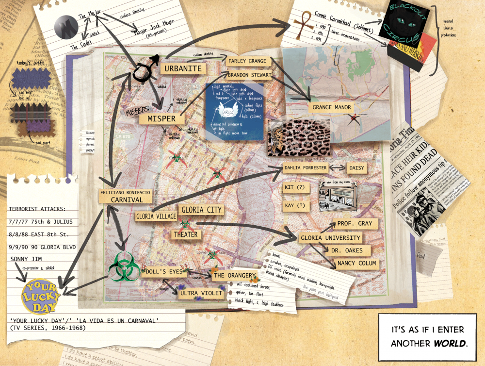
FIG. 1: Mind Map 1. The completed mind map featured in MSCSI Vol. 1, Issue 1, which visually establishes Cat's thought process to the reader for the first time.
FIG. 2: Development of Mind Map 1. This series of images charts the way I designed and created MSCSI's first mind map.
Subsequent maps reflect Cat's deeper investigations into characters that are first mentioned on the initial mind map. Brooker's script for the second mind map describes a composite of images themed around the inconsistencies surrounding celebrity superhero couple Urbanite and Misper, and their alleged civilian identities, Farley Grange and Brandon Stewart:
A montage of layouts, maps, architectural plans, diagrams, laid over and overlapping, giving a sense of the spaces and interiors that Cat is turning around in her mind, building a mental picture from various sources.
- A diagram of the conventional continuity editing camera setup, for studio shooting.
- A map of Grange Manor and the surrounding area (golf course, tennis courts, outside swimming pool, stables, avenue back to main road) showing it as a huge complex of buildings.
- An architectural plan of Grange Manor, clearly showing a dining area, ball room, reception, hall and the Man Cave: the public parts of the building on display, looking simple and obvious—but with the other rooms of the far larger complex not just blank, but scored out, as if confidential and censored.
- A 3D model, building in Cat's mind, of the inside and outside of Grange Manor, from various angles.
The key point is that the official “inside”—the parts shown on TV and in magazines, including the modestly-sized Man Cave—is significantly smaller than the outside; a suite of rooms, compared to a vast complex as shown on the map.
The script also requested images depicting the personal lives of Grange Manor's inhabitants, framed as if clipped from celebrity magazines.
(1) What details do I want the reader to immediately notice?
This mind map is tied together largely through the color green, and while it contains far less information than the first mind map I created, its individual images are highly detailed, inviting deeper scrutiny.
(2) What is the emotional tone of this mind map?
I chose the palette of this mind map to recall a traditionally masculine-coded gentlemen's club with colors such as dark browns and reds. Performance is a major theme of this mind map, as is public perception. To avoid areas of the mind map appearing empty by comparison to the “celebrity magazine” clippings, and to evoke the impression of furnishings, I added textured papers and vintage textile designs to the background.
(3) What are different ways the reader can use to navigate this mind map, depending on whether they are on a desktop or mobile device?
I took a similar approach to the one in the first mind map, providing the reader with a variety of different starting points for accessing its content:
- The image of Urbanite to the left of the image depicts the character lifting a weight above his head. While this image uses the color black to a greater degree than any of the other inset illustrations, and may therefore draw the eye to it first, the weight is angled toward the right hand side of the mind map, which contains more complex information.
- The inset images showing Grange Manor feature a uniform color palette in order to achieve visual unity and encourage the reader to view them as parts of a single whole, and to connect with the more saturated red, green, and brown of the mansion's map in the background (Figure 3).
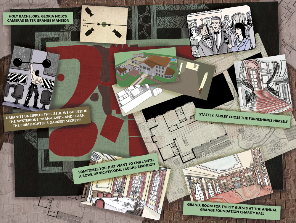
FIG. 3: Mind Map 2. The completed mind map featured in MSCSI Vol. 1, Issue 2, with a narrower focus on Cat's investigation into the inconsistencies of Grange Manor.
The third mind map, featured in Vol. 1, Issue 3, sees Cat conducting a dual investigation into villain Carnival's patterns of behavior and fallen theater star Connie Carmichael's reinvention into the superheroine Sekhmet. Unlike its predecessors, the content of this mind map was spread across four pages interspersed throughout the issue in time with Cat's findings. Carnival's clues are provided in a newspaper article, which Cat mentally annotates, and this serves as the background image of all four pages. Connie's parts of the mind maps are presented as a series of ten images cascading across a newspaper from left to right in chronological order across two pages, illustrated below:
- Connie as a little girl of about eight years old, sitting on a stoop in the 1970s, wearing a simple and inexpensive dress, her hair in cornrows. It's a busy, low-income neighborhood—maybe we see boys running past, mothers talking from one step to another, some graffiti (70s era) on a wall, clothes drying outside. We should be able to see a handwritten or printed label, “Carmichael,” on a row of doorbells.
Connie is just watching—in an echo of the way both Cat and Enrique watch the world, taking it all in, thinking and planning. - A dance studio in the 1980s. Connie is about 18 years old, dressed in a leotard and legwarmers. She's developed into an athletic, agile, lightly muscled young woman. She's ecstatic as she looks at a list on the wall, labeled “PAWS AND WHISKERS: CALLBACKS,” with names handwritten under it, including “Connie Carmichael.” Other dancers, male and female, are around her, some of them congratulating, half-hugging her, grinning.
- The musical, Paws and Whiskers—Connie in full costume with the cast during a performance, taking the applause at the end of a number.
- Connie on the cover of the program for a later production, Blackout Theater—clearly a starring role.
- Connie outside the stage door, carrying a sports bag—a studio manager holding up his hands in a “nothing I can do” helpless gesture as Connie, equally helpless, realizes her time with the musical has come to an end.
- Connie at a small table in a cramped kitchen area—a one-room studio, with bed and clothes visible in the background, a small high window. Letters are scattered in front of her, some folded, some crumpled. We can see details of one in the foreground—“Dear Ms. Carmichael, Thank you for your recent application. We regret to inform you…”—which indicates that all the others are also rejections.
- Connie in the box office booth of Paws and Whiskers, wearing a uniform—costumed members of the cast pass by, waving briefly to her, as she despondently punches tickets for the musical she used to star in. We can see a Blackout Theater poster, very similar to the one that starred Connie, now with a far lighter skinned black woman in the central role and costume “From June – starring Stella Shelley.”
- Connie, backstage and alone—clearly, she shouldn't be here—she's glancing off warily. She is wearing a costume from Paws and Whiskers, and lifting a large, elaborate, African/Egyptian style headpiece, about to crown herself with it.
- Connie at a desk in the Gloria University Library, reading the three books on Afrocentrism, Pan-Africanism, and Egyptian culture listed above on page 8. She could be concentrating hard, chewing a pencil (another pencil maybe pinning her hair).
- Connie on a rooftop, facing the Urbanite—his display reading “!!!” and his mounted spotlights illuminating her as if she's back in the theater—wearing her “showgirl” outfit [Jennifer's costume design].
(1) What details do I want the reader to immediately notice?
I wanted the panels displaying Connie's story to draw the reader's attention. Like Cat, this character has been underestimated and overlooked, until she finally takes ownership of her power and crafts a superhero persona that acts as a conduit for self-actualization and authenticity. However, I did not want Connie to exist in Cat's shadow, or to be defined by her, and so I chose to depict these ten images in a style evoking Polaroid pictures. In addition to serving the themes of nostalgia and reflecting on the past that the mind map required, these images offer mere snapshots into moments of the character's life, echoing Cat's thoughts that she can imagine, but not inhabit, Connie's story.
(2) What is the emotional tone of this mind map?
This mind map overwhelmingly possesses themes of nostalgia, anxiety, and loss, culminating in catharsis for Connie and uncertainty for Cat, whose investigation is still ongoing.
(3) What are different ways the reader can use to navigate this mind map, depending on whether they are on a desktop or mobile device?
Out of all of the mind maps, Connie's story has the most conventional page layout. Each page is designed to be read from left to right, top to bottom. These vertically designed pages echo the shape of a smart phone screen, and the scattering of images representing moments from Connie's life evokes the familiarity of both Polaroid photographs and Instagram images with their square-framed shapes (Figure 4).
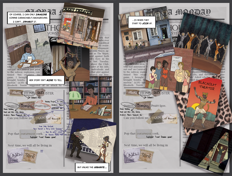
FIG. 4: Mind Map 3. The completed mind map featured in MSCSI Vol. 1, Issue 3, demonstrates the process of Cat putting together information about Sekhmet's history, against the backdrop of a newspaper reporting villain Carnival's recent terrorist attack.
3. IMPACT AND LEGACY
After completing the first issue of MSCSI, Brooker, Shore, and me turned to the medium of crowdfunding for the next stage of the project's development. Through comments on the comic's social media accounts, its message board, and a plethora of participatory activities such as music videos, cosplays, and illustrations from fans as well as both emerging and established artists, it was evident that we had an audience, and that they were eager for more of Cat and her world. Our first crowdfunding campaign in 2014 raised over £10,000, with £2,000 donated to charities A Way Out and Rape Crisis England & Wales (Brooker, 2013). Our second raised over £13,000 (Brooker, 2014). Team Cat's goal of using the webcomic medium for making MSCSI accessible to a diverse audience of readers has expanded the story world in unexpected but welcomed ways. As the series continued into its second volume, guest writers J.A. Micheline, Dee Emm Elms, and Angel Kumar invited readers into the lives and histories of characters whose backgrounds and experiences share many commonalities ¶ (Brooker, 2017). This expanding collaboration caught Brooker, Shore, and me by surprise, but in retrospect, perhaps it should not have been unexpected; a central part of the project's nature as both a celebration of the inspiring powers of superhero figures and a commentary about authentic representation in comics lay in its original iteration as a transformative Batgirl fan work. Some of the layers that comprise its intertextuality have emerged in unforeseen ways: due to the watercolor technique I developed and my use of fabric textures and clothing details in the first mind map, I was invited by Stylist Magazine in 2013 to collaborate with artist Rachael Smith on a two-page comic set in the world of MSCSI and celebrating the inclusivity and intersectionality of heroism. This publication in turn led to an invitation from the British Library in 2014 to speak about the evolution of female representation in superhero comics, on a panel which included comic creators Grant Morrison and Warren Ellis, both of whom are renowned for their subversion of audience expectations in their work. In 2015, the Feminist Library featured MSCSI as the focus of its January salon in London. Most recently, MSCSI has been used in the 2018-2019 academic year at the College of St. Rose by David Seelow in his course Texts and Contexts. The series served as the introductory reading for a unit that discusses iconic female superheroes including Wonder Woman, Ms. Marvel, and Supergirl. This application of MSCSI speaks to a less overt but no less inseparable part of the work: scholarship. Brooker's background in cultural studies and cinema foregrounds the series' scripts; it is present in the depictions of Gloria's ordinary citizens and their engagement with the world around them; it is inescapable in the relationship between its superheroes and their representation and curation of their images in Gloria's mass media. My background as a sequential artist and art historian, who was, at the time, taking my first steps into game theory, is a similarly inescapable part of the mind maps' design. Through transforming the tool of research mind mapping into artwork, I discovered that my pedagogical practice can be not only transformable but transformative to those experiencing it, even in such unexpected places as my work on this webcomic series. Webcomics are no strangers to learning and teaching, and as I discovered through my experiences with MSCSI, they do not have to be strangers to research methods as a source of artistic inspiration.
REFERENCES
Alverson, B., 13 Great Webcomics for Kids and Teens, accessed April 20, 2019, from https://www.slj.com/?detailStory=13-great-webcomics-for-kids-and-teens, 2016.
Barthes, R., Mythologies, New York: Hill & Wang, 2013.
Blaylock, J., How to Self-Publish Comics…Not Just Create Them, Chicago, IL: Devil's Due Publishing, 2006.
Brooker, W., Kickstarter Campaign Page for MSCSI Vol. 1, accessed April 1, 2019, from https://www.kickstarter.com/projects/mscsi/my-so-called-secret-identity?ref=discovery&term=my%20so-called%20secret%20identity, 2013.
Brooker, W., Kickstarter Campaign Page for MSCSI Vol. 2, accessed April 1, 2019, from https://www.kickstarter.com/projects/mscsi/my-so-called-secret-identity-volume-2?ref=nav_search&result=project&term=my%20so-called%20secret, 2014.
Brooker, W., The MSCSI Matrix: Impact and Influence, accessed April 1, 2019, from https://www.mysocalledsecretidentity.com/backstory, 2017.
Brooker, W., Shore, S., and Zaidan, S., My So-Called Secret Identity, accessed December 10, 2018, from https://www.mysocalledsecretidentity.com/, 2012.
Campbell, T., The History of Webcomics, San Antonio, TX: Antarctic Press, 2006.
Common Sense Media, Classroom-Friendly Websites and Apps for Making Comics, accessed May 30, 2019, from https://www.commonsense.org/education/top-picks/classroom-friendly-websites-and-apps-for-making-comics, 2016.
Duncan, R. and Smith, M.J., The Power of Comics: History, Form, and Culture, New York: Continuum, 2009.
Koster, R., A Theory of Fun for Game Design, Sebastopol, CA: O'Reilly Media, 2004.
McCloud, S., Reinventing Comics, New York: Paradox Press, 2000.
Munroe, R., XKCD, accessed April 1, 2019, from https://xkcd.com/, 2005.
Nyberg, A., Seal of Approval: The History of the Comics Code, Jackson, MS: University Press of Mississippi, 1998.
Ostertag, M. and Mulligan, B.L., Strong Female Protagonist, accessed April 1, 2019, from http://strongfemaleprotagonist.com, 2012.
Peirce, C.S., The Essential Peirce Vol. 2, Peirce Edition Project, Bloomington, IN: Indiana University Press, 1998.
Sabin, R., Comics, Comix & Graphic Novels: A History of Comic Art, London: Phaidon Press Limited, 1993.
Shore, S., Creating a Cool Superheroine: Artist Suze Shore on My So-Called Secret Identity, accessed May 7, 2019, from http://feministlibrary.co.uk/creating-a-cool-super-heroine-artist-suze-shore-on-my-so-called-secret-identity/, 2015.
Short, T.L., Peirce's Theory of Signs, Cambridge, MA: Cambridge University Press, 2009.
Wandtke, T.R., The Meaning of Superhero Comic Books, Jefferson, NC: McFarland & Company, Inc., 2012.
NOTES:
† The Superman radio show was broadcasted on New York's WOR station from 1940 to 1949, while Fleisher Studios (later Famous Studios) produced seventeen animated shorts between 1941 and 1943.↩
‡ The results of these studies generally paint comics as a negative influence on their young readers, although there are a few studies that claimed reading comics have no ill effects and can be useful educational tools. Nyberg details these studies and the responses they received.↩
§ At the time Brooker approached me regarding this project, DC Comics was the subject of much controversy among the comic book community and the mainstream press for its depiction of female characters and the lack of female content creators in its New 52 series of titles, which launched in 2011.↩
¶ Brooker describes this further: “(MSCSI) also invited new writers to tell stories about characters with similar experiences to their own: J. A. Micheline writing Connie Carmichael, and trans author Dee Emm Elms exploring Kit Farben's history and identity. In 2015, Angel Kumar wrote to me through our Facebook fan-group, to ask if I'd considered including a British Asian character in Volume 2. I had been considering it — as an analogue to John Constantine, Hellblazer — and I asked if she would like to write the story. She took the opportunity, with enthusiasm. Now, Angel is always credited, in print and online, as creator of Radhika Shere, just as Bob Kane and Bill Finger are with Batman.”↩
Comments
Show All Comments