USING REAL-TIME VIDEO ANALYTICS TO IMPROVE INSTRUCTION
Abstract
The explosive growth of enrollment in courses, especially in engineering and computer science, has resulted in the need to rethink how to deliver instructions in large courses. As the number of students increase, it is simply not possible to increase staff and/or add more teaching facilities to deal with the situation. Instead, we must think of innovative ways to design technology and rethink delivery methods to improve instruction. One possible way to handle large numbers of students and/or improve instruction is to integrate well-produced instructional videos into the curriculum. In this paper, we describe a new technology platform that was developed at a major research university to address the scale and academic diversity of students taking computer science courses. By scale we mean the number of students taking a course, and by academic diversity we mean the varied levels of academic backgrounds that these students come from. The key idea of our project is to provide an easy-to-use platform and use real-time analytics to identify topics that need extra attention and/or identify students for whom intervention is necessary. Although we discuss large computer science courses, we believe that the technology and method discussed in this paper are equally applicable to any discipline and/or class size.
Concepts
- Information systems → Data management systems → data structures
- General and reference → Cross-computing tools and techniques → design, empirical studies
KEY WORDS: algorithms, introductory CS, scale in CS education, video-based instruction, data structures, interactive videos, analytics, data-driven teaching
1. INTRODUCTION
The background for the findings in this paper are two courses taught at an Ivy League institution with a total enrollment of over 600 students per semester. The traditional instructional model of large computer science courses (> 150) typically involves two lectures per week followed by small group meetings called precepts or recitations. The traditional lecture model is an effective way to deliver instructions when class sizes are small. However, as enrollments grew (Committee on the Growth of Computer Science Undergraduate Enrollment, 2018) universities just kept increasing class sizes, although the ineffectiveness of large lectures is well documented in research literature (Bajak, 2014). In this paper we will address how to deal with scale and academic diversity of the students taking introductory computer science (CS) courses using a new technology and data-driven teaching methods.
In the context of this paper, we define “scale” as the size of the courses and “academic diversity” as the variation in the level of preparation among students. As more nonmajors sign up to take introductory CS courses, the level of preparation among students varies widely. We are a major research university in the USA with an admission rate of about 6%, which makes the student body extremely capable. However, their computing backgrounds vary widely. While some students have been programming since they were five years old, others have just started programming and are learning about computer science. Our goal is to teach the same course to majors and nonmajors, despite their computing backgrounds. This makes it difficult to meet the needs of the academically diverse student body taking introductory courses at our institution. The trend of more nonmajors taking computer science courses is now common across major research institutions, as shown in Figure 1, and is expected to continue.
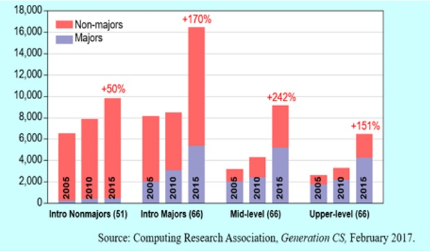 Figure 1: The trend of more nonmajors taking computer science courses is now common across major research institutions"/>
FIG. 1: The trend of more nonmajors taking computer science courses is now common across major research institutions
We believe that by using innovative technology and creative teaching methods (Christopher, 2003; Bergman and Sams, 2012) we can address the scale and academic diversity of students taking large classes. However, the technology and methods discussed in this paper are equally applicable to all disciplines and/or any class size. We invite other instructors to adopt this new technology and modify some of the methods that we discuss in this paper to their own context. The paper is organized as follows. In Section 2, we describe the technology and its design. In Section 3, we describe implementation details. In Section 4, we show visualizations based on data we have collected so far. In Section 5, we discuss ways to use data to drive classroom instructions. In Section 6, we discuss conclusions and how to adopt similar methods, perhaps in your courses.
2. TECHNOLOGY AND THE DESIGN
2.1 Technology
Despite the use of course management technologies such as discussion forums, submission systems, and automated grading in computer science courses, many courses still do not employ technologies that can provide real-time analytics on student performance as a class, a group, or individuals. If real-time analytics are available (Gunawardena, 2017), instructors can adjust instructional techniques in time to meet the student, group, or class needs. For example, if instructors can visualize what topics are difficult in general for students to comprehend, they can give additional instructions or direct students to find more help on those topics. If the instructor knows specific students who are having trouble early on, then they can intervene to provide additional help. However, these things are not easy to do in large classes and for the most part in any class. The use of good technology and data-driven technologies can help. With that goal in mind, we started to develop a flexible video-based technology solution with the following goals in mind.
2.2 The Design
We used the following design goals to develop the technology and deploy it in classrooms:
- The technology is built using open source technologies to allow more community support to extend the technology beyond its capabilities as necessary.
- For those who want to use existing software for free, a version will be hosted at http://www.danuma.org.
- All videos are hosted on YouTube. This makes it easy for instructors to adopt the platform for any existing collection of videos. They can use a playlist of videos or upload their own videos to build a collection.
- All videos are supported by interactive and synchronized text transcripts. The transcripts are automatically generated by the platform, punctuated, and structured to provide a more interactive experience.
- Videos are searchable across all collections, so that users can find topics of interest quickly. The search produces all matches to a query term and allow users to jump to the exact location of any video at any time stamp.
- Real-time dashboards are available for students and instructors. The student dashboard serves as a way for students to know which videos are currently due, videos they missed, and their performance on video-based self-assessment quizzes. The instructor dashboards display real-time data such as percentage of students who watched videos and attempted quizzes.
3. IMPLEMENTATION
Next we present key features of the platform. These features were implemented to enable a good user experience when using the videos. For example, videos should be easily accessible. Figure 2 shows that as students log in to the system (using Google authentication or institutional authentication), they are able to access not only the videos related to the courses they are currently taking but also videos of other courses offered by the department or school.
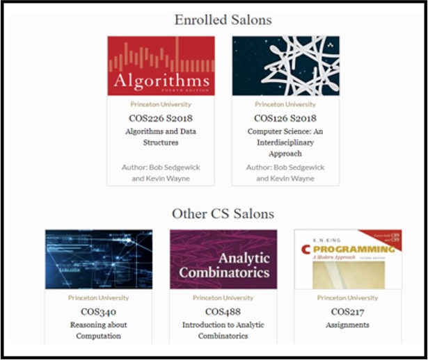 Figure 2: As students log in to the system, they are able to access the videos related to the courses they are currently taking as well as videos of other courses offered by the department or school"/>
FIG. 2: As students log in to the system, they are able to access the videos related to the courses they are currently taking as well as videos of other courses offered by the department or school
In this paper, we use the term “salon” to describe a course video collection. As shown in Figure 2, students can access their current courses (listed under Enrolled Salons) or videos of other courses (listed under other salons). After choosing a collection, students are directed to the specific collection as shown in Figure 3.
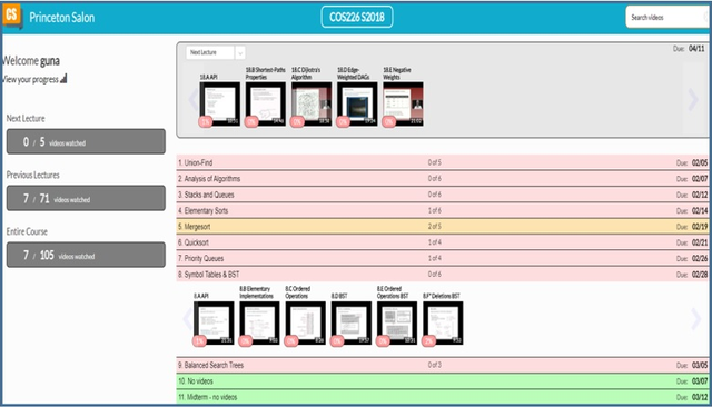 Figure 3: Students have access to the course video collection and ways to access videos from other lectures"/>
FIG. 3: Students have access to the course video collection and ways to access videos from other lectures
In Figure 3, students have access to the course video collection (with clear markings of current lecture/week videos) and ways to access videos from other lectures. The left side of Figure 3 shows that students can see how many videos of the next lecture they have watched as well as previous lectures they have missed.
In each of our collections, we had close to 100 short videos, each about 10–15 minutes in length. A typical 80-minute lecture, therefore, would consist of about four to five short videos. Students have the option to watch videos at different speeds to suit their needs. Students can also search videos based on a query term. For example, Figure 4 shows the results from the global query (search over the entire collection) for the term “compress.”
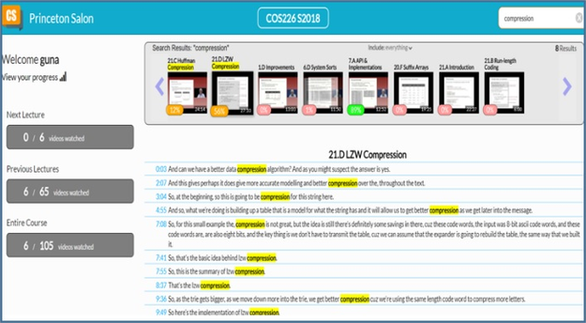 Figure 4: The results from the global query for the term “compress”"/>
FIG. 4: The results from the global query for the term “compress”
We note that queries are done across videos (inter) and within videos (intra) to find the most granular matching video clip. For example, as shown in Figure 4, the query resulted in many video hits (shown in search results), and upon selecting one of the hit videos (21.D LZW compression), the user can see the locations of that video where the query term appears. This allows users to jump to the exact location of the specific video.
Next, we show how students experience the videos using this new platform. Figure 5 displays how students view videos. The view screen is divided into three panels. The left panel is the table of contents and allows students to access any video in the collection instantly.
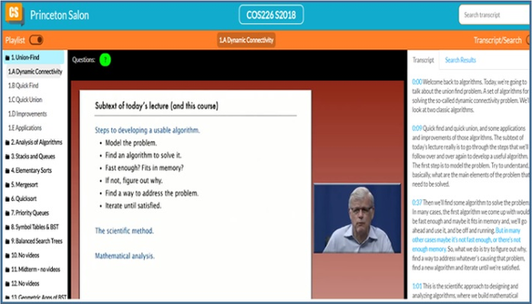 Figure 5: The view screen for videos"/>
FIG. 5: The view screen for videos
The middle panel is the standard YouTube-based panel where users can use functionalities such as setting playback speed of the video. The right panel is an innovative new design to the video platform which displays interactive and synchronized transcripts. The synchronized transcripts allow users to see which part of the video is currently playing (highlighted by blue on the right panel). The interactivity of the platform allows students to select any text segment of the audio and jump instantly to that location.
We note that students appreciated the availability of these interactive transcripts. Over 60% of the students always had the transcripts panel open, which allowed them to see the “before” and “after” context of the current video segment that was playing. Some students noted that the experience is like reading a book while watching the same book as a video. This multisensory experience allows users to comprehend material quickly, as it allows students with different learning styles and backgrounds (academic diversity) to learn material using either visual experiences or textual experiences, and in most cases both.
4. DATA VISUALIZATION
The core idea of new technology design and implementation is the use of data to drive classroom instruction and identify early on students who may be struggling with the course. We call this “data-driven” teaching and learning. Although these types of tools were unimaginable or unavailable just a few years ago, new technologies enable opportunities for any instructor to use data to understand student behavior and adjust instructions to maximize the teaching and learning outcomes. The era of big data in education is here. In the fall of 2017 alone, we collected over 2.7 million short data records from October to December. Each of these data points is a 5-second granular interaction record that provides very useful information.
As shown in Figure 6, each data point contains the date/time of the activity, the location of the video, the playback rate, user information (not shown), and the specific video the user is accessing. Having 2.7 million such records allowed us to produce some interesting visualizations. These visualizations provide good insights into student activities that can lead to both short-term and long-term benefits of data-driven teaching and learning activities.
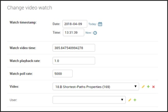 Figure 6: Data points for a sample video"/>
FIG. 6: Data points for a sample video
4.1 Overall Behavior
Next, we look at some of the visualizations to understand how and when students are using videos. Figure 7 shows at what speeds students are accessing videos. The x axis is the video ID; videos 1–97 are from the first introductory course (CS1) and videos 98–175 are from the second course (CS2). The y axis is the count of 5-second segments. For example, a count of 75,000 translates to about 104 hours of total video watching time across all students for that specific video.
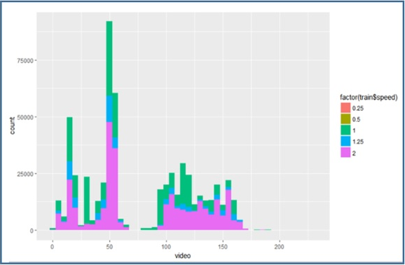 Figure 7: The speeds at which students are accessing videos"/>
FIG. 7: The speeds at which students are accessing videos
As shown in Figure 7, we note that a fairly large number of students are watching videos at 2x speed (marked in purple), and the behavior is consistent across all videos. Figure 7 also shows that there are more video views in CS1 than in CS2. This is because videos were the primary component in CS1 and secondary component in CS2 in fall 2017. This means that students in CS1 were expected to learn new topics using videos, while students in CS2 only watched videos if they needed more clarification. In spring 2018, both CS1 and CS2 used videos as a primary instructional resource.
The other interesting observation is how the video watching is related to the grade they can expect to receive in the course.
Figure 8 shows an interesting correlation between hours watched (x axis) and the total count (y axis) and how they are related to the course grade. One interesting observation coming from this data is that “A” students tend to spend less time with videos than “B” students. “C” students tend to spend about the same time as “A” students.
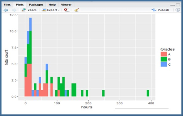 Figure 8: Correlation between hours watched and the total count, and how they are related to the course grade"/>
FIG. 8: Correlation between hours watched and the total count, and how they are related to the course grade
How can we explain this observation? Although unintuitive at first, this makes sense if we think about it. The “A” students probably don’t need to spend as much time as “B” students, as they are fast learners or already have some background in the subject. On the other hand, “B” students are average students who need to spend more time to comprehend things. The “C” students are perhaps not spending enough time watching videos (and they should).
Now that we know at least 50% of the videos are played at 2x speed, is there a way to see how students are watching different parts of the videos? Do they generally play back videos at the same speed throughout the video or speed things up toward the end of the video?
Figure 9 provides some answers to this question. In Figure 9, the x axis is the video ID and the y axis is the location of the video. For example, location value 2000 means that it is the 2000th second of the video. We note that the longest video in this collection is slightly above 2000 seconds or about 30+ minutes in length. The color indicates the speed at which the video is played at a specific time stamp.
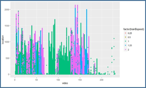 Figure 9: Video playback speeds"/>
FIG. 9: Video playback speeds
We make a few observations based on Figure 9:
- In CS1 (intro course) the videos seem to have been played back at regular speed for the most part.
- In CS2, the early videos were played at regular speed (green color), but the later videos were played at 2x speed.
- For the most part, the videos were consistently played back at the same speed at all locations.
What do these observations tell us? In CS1 students are still learning early concepts in computer science and most students seem to watch videos around standard speed. However, toward the end of the semester (video IDs > 60), students in CS1 seem to speed up the videos. On the other hand, students in CS2 are more experienced in computer science, but they also start slow and speed up the videos toward the latter part of the course. A reasonable explanation for this observation from Figure 9 is that if the topics are easier, students tend to speed things up. Also, CS2 students are more likely to speed things up than CS1 students during the second half of the course. Instructors can use this information in any way they’d like to adjust classroom instructions. These visualizations, among others, can give instructors good insight into their students’ behavior.
4.2 Individual Student Behavior
What other visualizations are possible? How about we plot individual student behavior? Figure 10 shows the amount of time each student spends watching videos.
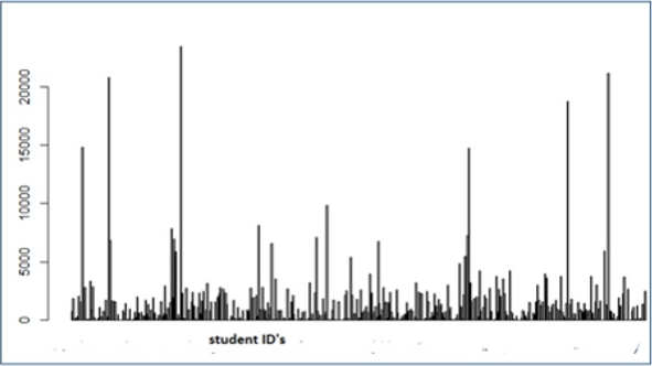 Figure 10: The amount of time each student spends watching videos"/>
FIG. 10: The amount of time each student spends watching videos
In Figure 10, the x axis is the student ID (not shown) and the y axis is the time spent in views. Some students tend to spend a lot more time than others (high bars). Most students seem to be under 5,000 seconds. Our interpretation is that those students who are spending way too much time are perhaps having some difficulty with the course. Therefore, it is possible to provide early intervention as needed. However, we caution that these observations must be combined with other instructor observations about a student before acting on data. In other words, analytics alone would not be enough to act, but it may be used as a trigger to look at other indications of the student to decide how they are related to what the data tells us.
What other behaviors are displayed by students when using videos? We noted that one of the best innovations of the video system is the interactive transcripts that allow students to experience both the video and the accompanying transcript at the same time. So what percentage of students use the transcripts as a guide for learning and/or navigation?
As shown in Figure 11, most of the 500+ students seem to keep the table of contents panel open for easy navigation. However, the proportion of students keeping the transcripts panel open was around 3:2. That is, about 60% of the students kept the transcripts open. Therefore, one may conclude that 60% of students are typically guided by transcripts and/or inter- or intravideo search to find places of interest. This indicates that adding more innovative ideas to the transcript design is perhaps a worthy effort.
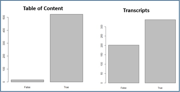 Figure 11: Number of students who keep the table of contents panel open; number of students who keep the transcripts panel open"/>
FIG. 11: Number of students who keep the table of contents panel open; number of students who keep the transcripts panel open
5. DATA-DRIVEN CLASS DESIGN
The use of technology is a necessary component in today’s classrooms. Most courses today use some form of technology to deliver instructions and assess students. The instructions are typically delivered using a course management system (CMS) such as Blackboard, Canvas, Moodle, or others. Instructors also use a variety of other tools such as videos, animations, virtual reality, augmented reality, and other technologies in their courses. All these tools are expected to increase student engagement in the course. However, the key is that all these systems also produce large amounts of data and may provide insights into student thinking. Our goal was to design classes to use more real-time data to make instructional decisions.
We followed the following guidelines in creating data-driven courses:
- Adopt more visual technologies such as videos to increase student engagement.
- Redesign or rethink existing courses to see how to integrate the visual components as primary or secondary instructional components of the course.
- Introduce self-assessment activities such as embedded quizzes in each video.
- Design instructional strategies (before, during, and after class) to engage students with visual learning.
- Use data frequently to adjust instructions or intervene with students who may be struggling.
- Use data to guide teaching and learning, but not as an assessment instrument.
- Adopt existing video technologies (http://www.danuma.org) to create data-driven class instructions.
6. CONCLUSION
In this paper we discussed a redesign of introductory CS courses to address scale and academic diversity of students using new methods, technology, and actionable analytics. The methods used in computer science courses are equally applicable to any course in any domain, if there is a video collection to support the instructions. There are many freely available videos online and/or instructors can create interactive videos using tools like Camtasia Studio (https://www.techsmith.com, 2018). The new interactive video technologies and deployment to 500+ students generated data that we have not seen before. The analysis of this data yielded many important observations on collective student behavior that would have not been possible without the use of technology.
We were encouraged by the adoption of the platform by many instructors at our institution and the institutional commitment to continue the support of the system. Over 86% of the students liked the newly redesigned courses. We still have to work hard to make sure more students are satisfied with the course design and use of technology. The instructors are seeking more meaningful real-time dashboards that can help make decisions quickly. We are experimenting with predictive analytics methods that can help instructors make more sense from data across many dimensions. Students are also providing helpful feedback on how to make the system more useful. Some students would like a chat room type of facility to learn with other students. Some would like to see Q&A capabilities for each video. Others would like more features that will allow them to plan how they watch videos.
The future of the video system design is to keep it simple. Do one task very well. Support workflows of students and instructors well. We would also like to find ways to share data with other CMS systems using standards such as Learning Tools Interoperability (LTI). We believe that instructors will continue to use multiple technologies to manage their classes. But in using LTI, we can make all of them work like one system.
If you are interested in using this video system, please visit http://www.danuma.org.
ACKNOWLEDGMENTS
This research is partially funded by the 250th innovation grant at Princeton University and the Department of Computer Science at Princeton University. We also recognize the contributions of Rob Whitaker, who played a leading role in designing the original technical architecture. We also recognize faculty such as Kevin Wayne, Bob Sedgewick, Alan Kaplan, Dan Leyzberg, Jeremie Lumbroso, and Ibrahim Albuluwi, who provided invaluable guidance in the design and evolution of the system. We also thank all students who provided feedback to help improve the platform.
REFERENCES
Bajak, A., Lectures Aren’t Just Boring, They’re Ineffective, Too, Study Finds, Science Magazine, May 12, 2014. Retrieved from https://tinyurl.com/zug9xtd.
Bergman, J. and Sams, A., Flip Your Classroom: Reach Every Student in Every Class Every Day, Washington, D.C.: International Society for Technology in Education, 2012.
Camtasia Studio, Retrieved from https://www.techsmith.com, 2018.
Christopher, D.A., Interactive Large Classes: The Dynamics of Teacher/Student Interaction, J. Business Econom. Res., vol. 1, no. 8, 2003.
Committee on the Growth of Computer Science Undergraduate Enrollment, National Academy of Engineering Report, 2018. Retrieved from https://tinyurl.com/y98zxoft.
Gunawardena, A., Brief Survey of Analytics in K12 and Higher Education, Int. J. Innovations Online Learning, vol. 1, no. 2, 2017.
1 Comments
Show All Comments